Plotting Data From A CSV with Matplotlib
After I got all that data from the logs, my boss wanted it in a nice graph. First of the active user numbers, then the top 15 users. I knew that, despite having never used Matplotlib, it will still take me less time to learn it than any of my other options. I was able to get my script running and plotting correctly in less than two hours, so I felt pretty good about that. However, I had a few nested for loops and I wasn't a big fan. Enter the crowd-sourced code review! My friend Jenny was able to come up with a cool alternative to my solution that I ended up using. She utilized plot_date to sort the dates/data, which really helped (I was doing all sorts of crazy fun things).
So here's an example of what active_users.csv looked like:
system,au1,au30,date
jira,5,20,2016-06-09
confluence,16,23,2016-06-09
jira,8,22,2016-06-10
confluence,18,26,2016-06-10
jira,10,22,2016-06-11
confluence,18,26,2016-06-11
jira,11,23,2016-06-12
confluence,19,27,2016-06-12
jira,13,24,2016-06-13
confluence,19,28,2016-06-13
jira,8,24,2016-06-14
confluence,10,28,2016-06-14
jira,9,26,2016-06-15
confluence,15,30,2016-06-15
jira,15,26,2016-06-16
confluence,20,30,2016-06-16
he biggest problem was determining how to store the data in the program in a way that could be easily plotted. End solution? A dictionary of arrays. Or more precisely, a dictionary of a dictionary of arrays. With each line, we appended each data point to the matching array, which meant that a given date had the same index as it's data. And boom! It works!
import matplotlib.pyplot as plt
import csv
from datetime import datetime

active_users = {
  'jira': {
    'dates': [],
    'au1': [],
    'au30': []
  },
  'confluence': {
    'dates': [],
    'au1': [],
    'au30': []
  }
}

with open('active_users.csv') as csvfile:
  active_users_csv = csv.reader(csvfile)
  for system, au1, au30, date in active_users_csv:
    active_users[system]['dates'].append(datetime.strptime(date, '%Y-%m-%d'))
    active_users[system]['au1'].append(au1)
    active_users[system]['au30'].append(au30)

plt.plot_date(active_users['jira']['dates'], active_users['jira']['au1'], label='jira au1', color='orange', fmt='-')
plt.plot_date(active_users['jira']['dates'], active_users['jira']['au30'], label='jira au30', color='red', fmt='-')
plt.plot_date(active_users['confluence']['dates'], active_users['confluence']['au1'], label='confluence au1', color='green', fmt='-')
plt.plot_date(active_users['confluence']['dates'], active_users['confluence']['au30'], label='confluence au30', color='blue', fmt='-')
plt.legend(bbox_to_anchor=(0., 1.02, 1., .102), loc=3,
           ncol=4, borderaxespad=0.)
plt.show()
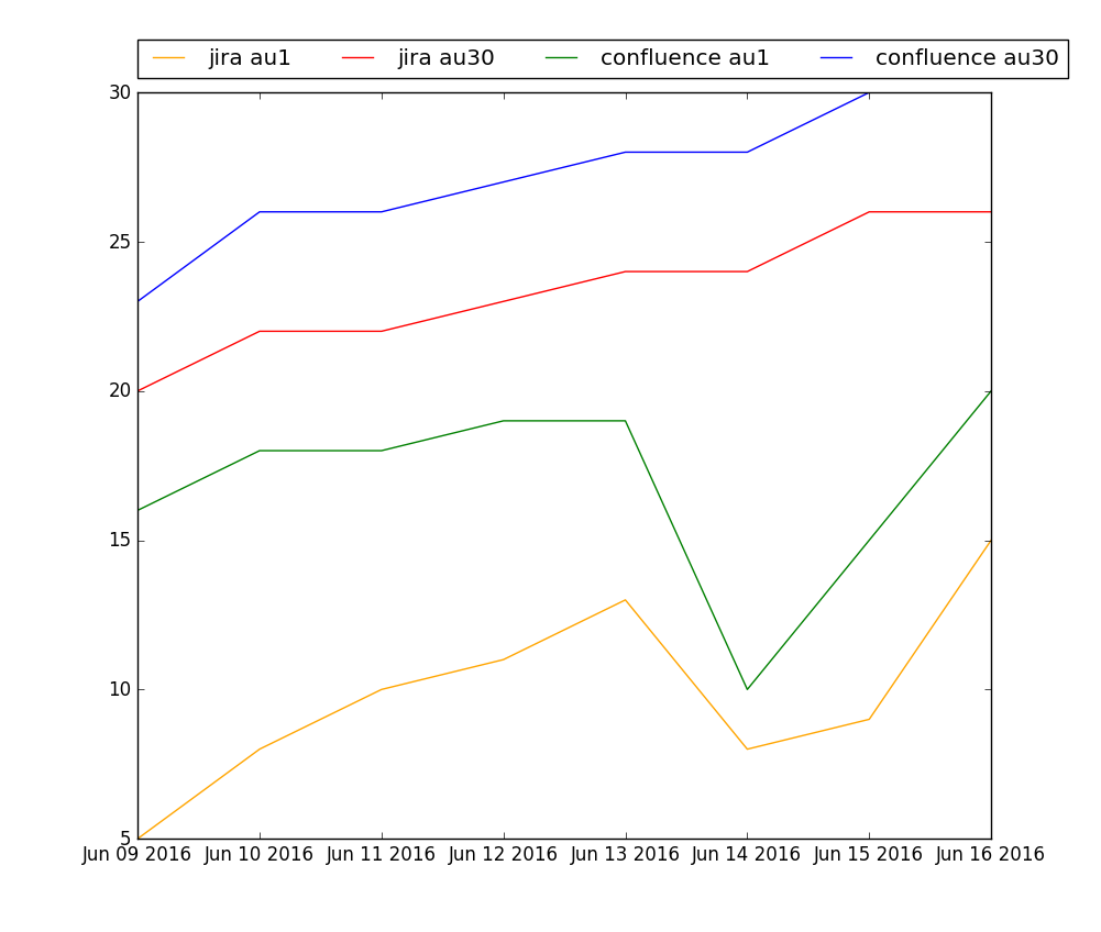
Resulting graph of AU1 and AU30 numbers
Ok, so now that graph #1 is done, I had to graph the top 15 users over the past week and their usage patterns. First off, here's an example of the data I was working with:
User,Date,Request Count
jsmith,2016-06-20,12
kthrace,2016-06-20,1
shastings,2016-06-20,11
sbristow,2016-06-20,3
jmccoy,2016-06-20,3
akoni,2016-06-20,9
gmorrison,2016-06-20,4
pfisher,2016-06-20,18
ndrake,2016-06-20,10
lbriscoe,2016-06-20,7
egreen,2016-06-20,13
crubirosa,2016-06-20,20
avanburen,2016-06-20,2
mlogan,2016-06-20,18
ckincaid,2016-06-20,11
rcurtis,2016-06-20,21
jfontana,2016-06-20,16
clupo,2016-06-20,5
kbernard,2016-06-20,7
Obviously, with our actual prod data, there were thousands of users... so a few more lines to loop through. The first problem was to put the data into a format I could use. Since even a top user might not use the system at all one day (say a Sunday), I couldn't use a simple dictionary; this time I had to utilize defaultdict. Defaultdict enabled me to create a dictionary of users where the value was (by default) an array of 7 zeros (representing usage for the past 7 days). After that, I was able to loop through the file for each day. To get the file names, I had to start with yesterday's date and go backwards. The date still gets appended to the 'dates' array, but the big change is in users: instead of appending the data to an array, I insert it into the index that matches that day.
So now that I have a dictionary of dates and users, I have all that I need to determine the top 15 users of the week. I create another dictionary that has the users as keys and sums up their total requests from the array and sets that as the value. Once I do that, I sort it, end up with a tuple, reverse it, then slice off the top 15. At that point, I just need to loop through my weekly_active_users list and then plot each user's data! Though I did have one, final (much smaller) problem: I had to find 15 matplotlib colors that I could use and distinguish. I created my array of colors and added a counter to each loop so I could add a unique color to each user. Success!
import matplotlib.pyplot as plt
import csv
from datetime import datetime, timedelta, date
from collections import defaultdict
import operator
from itertools import islice
import re

active_users = {
  'jira': {
    'dates': [],
    'users': defaultdict(lambda: [0] * 7)
  },
  'confluence': {
    'dates': [],
    'users': defaultdict(lambda: [0] * 7)
  }
}

active_users_weekly = {
  'jira': {},
  'confluence': {}
}
current_date = date.today()
day = timedelta(days=1)

for i in range(0,7):
  current_date = current_date - day
  current_date_txt = current_date.strftime('%Y-%m-%d')
  for system in ['jira', 'confluence']:
    active_users[system]['dates'].append(current_date)
    with open("active_users_{0}_{1}.csv".format(system,current_date_txt)) as csvfile:
      users = csv.reader(csvfile)
      for user, log_date, request_count in users:
        active_users[system]['users'][user][i] = int(request_count)

sorted_active = {'jira': {}, 'confluence': {}}
for system in ['jira', 'confluence']:
  for user, request_list in active_users[system]['users'].items():
    active_users_weekly[system][user] = sum(request_list)
  sorted_active[system] = sorted(active_users_weekly[system].items(), key=operator.itemgetter(1))
  sorted_active[system].reverse()
  sorted_active[system] = list(islice(sorted_active[system],15))

fig = plt.figure()
jira = fig.add_subplot(211)
jira.set_title('JIRA')
conf = fig.add_subplot(212)
conf.set_title('Confluence')
colors = ['red', 'gold', 'darkorange', 'green', 'turquoise', 'dodgerblue', 'navy', 'darkviolet', 'violet', 'pink', 'darkslategrey', 'silver', 'blue', 'lime', 'orange']

i = 0
for user, request_num in sorted_active['jira']:
  jira.plot_date(active_users['jira']['dates'], active_users['jira']['users'][user], label=user, fmt='-', color=colors[i])
  i += 1

i = 0
for user, request_num in sorted_active['confluence']:
  conf.plot_date(active_users['confluence']['dates'], active_users['confluence']['users'][user], label=user, fmt='-', color=colors[i])
  i += 1

jira.legend(bbox_to_anchor=(0., 1.1, 1., .102), loc='lower center',
           ncol=8, borderaxespad=0.)
conf.legend(loc='upper center', bbox_to_anchor=(0.5,-0.1), ncol=8)
plt.show()

Oooh pretty colors! Also, fake data makes for a bad graph.